Inhabiting Advertising
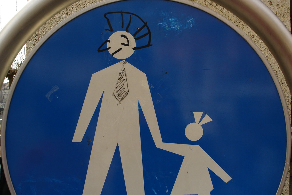
For about ten years, between 2004 and 2015, I kept photographing what people do to advertising and signage in public space. The pedestrian-crossing figure with a mohawk drawn on him in Ljubljana. The Stick no bills sign in Dubai covered in bills. A torn poster in London revealing three older posters underneath. The painted facades in Tirana where a mayor decided to override commercial dereliction with civic colour. A mattress wired into a fence in rural Italy, doing the work that a sign would have done. I called it, in my head at least, Inhabiting Advertising.
It lives across a tag on Flickr with 658 photographs, a near-empty inhabitingadvertising tag (one photo, the only place where I named it), and eight curated sub-albums: Pedestrian subversion, The Adventures of Helvetica Man, Helvetica hand, Stygge Oslo, Tirana colour, Defending rural space in Italy, Misplaced focus, and an unlisted set from a single 2005 Dubai trip.
The seed: Ljubljana, February 2005
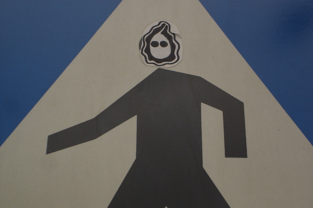
It started in Ljubljana, in February 2005. Eleven photographs over four days of pedestrian-crossing pictograms that someone had been adding to with a marker pen. A mohawk. A baby with horns. Slovenian words written backwards on a signpost. A black ghost-mask sticker, stuck over the head of a yield-sign pedestrian, like a small Munch face on a sign that had stopped meaning what it once meant. Once you see this, you cannot stop seeing it: the standard international pictogram, supposed to be neutral and unauthored, is everywhere quietly being completed by hand.
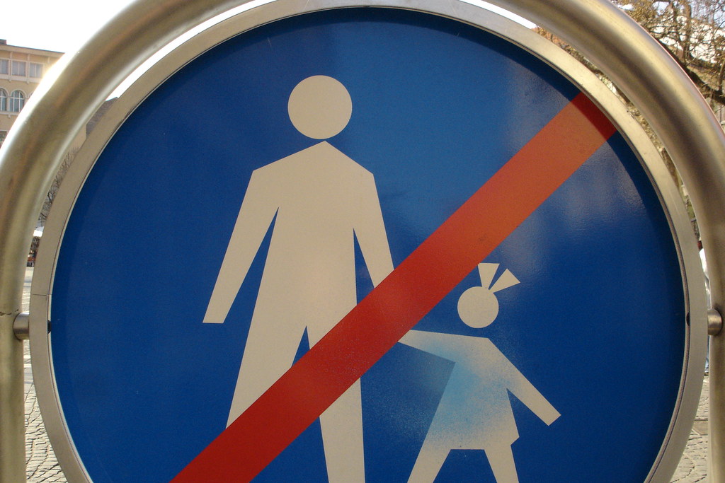
The small album does, in miniature, what the larger project would spend a decade doing across thousands of frames. There’s the modified pictogram (the mohawk, the bow-clip in the girl’s hair). There’s the negated sign (the painted red diagonal slash that converts pedestrian crossing into no pedestrians). There’s the partially erased ghost. There are the Slovenian-language overwrites — Vedno Anavrin, “Always Nirvana” written backwards. The pedestrian-crossing pictogram, which is supposed to be neutral and international, is everywhere a substrate for handwriting. Pedestrian Subversion is the seed because it identifies the unit of the larger investigation: the public icon as a surface that people complete.
Helvetica Man and Helvetica Hand
Two of the curated albums focus on the typological side of the project. The Adventures of Helvetica Man is a hundred-photograph collection of the AIGA pedestrian-style pictogram — the universal little figure that means person on every airport, lift, toilet, and station sign in the world. “Helvetica Man” is Ellen Lupton’s nickname for him; the figure was designed in 1974 by the AIGA and the US Department of Transportation and is now everywhere. Helvetica Hand is the same project applied to the universal press here / push / pull / do not touch hand pictogram. Both albums are field notebooks for a designer who, at the same time, was trying to extend that visual language into the new digital surfaces of RFID, touch interaction, and networked things. The argument runs through to the November 2005 essay Graphic language for touch.
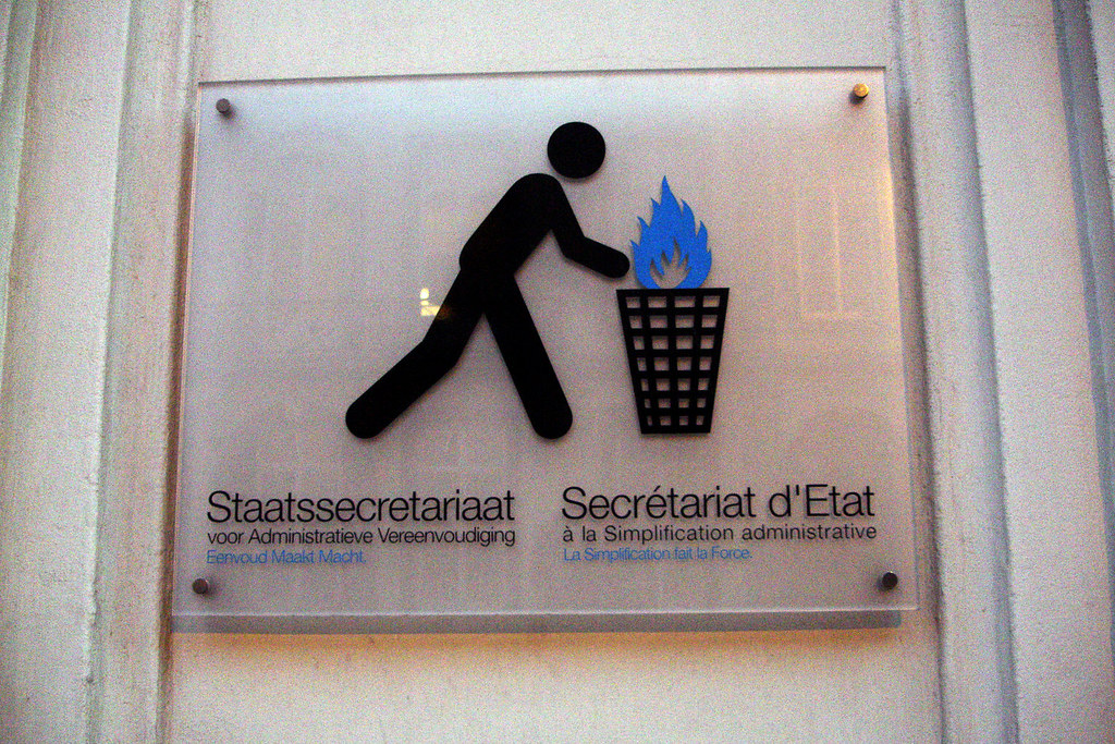
Helvetica Man’s adventures take him into peculiar places. He is reduced to a stick (the simplification icon at a Belgian state secretariat, where his job is to throw paperwork into a flaming bin). He carries a dog up a lift. He warns the elderly, the injured and the pregnant on every metro in the world. He stands beside a bicycle, in profile, on a thousand cycle-path signs. He is an obsolete figure with a Walkman on a sign whose pictogram has not been updated. The point is that he is everywhere, that he is treated as universal, and that his daily life as a working pictogram is so much stranger than the standards committees that codified him in 1974 might have predicted. To photograph the standard pictogram is to record what design did once it left the studio.
Cities
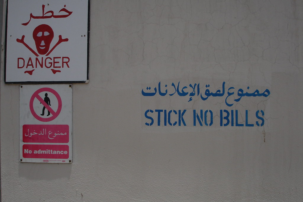
This was a body of work that travelled. In July 2005 I spent ten days in Dubai — that strange newly-rich Gulf city in the moment just before it really took off — and made 137 photographs of its visual contradictions. Hand-painted shopfronts in alleys two blocks from corporate towers. Empty glass office buildings with telephone numbers spray-painted on the windows. Walls reading Stick no bills in English and Arabic where every other surface in the alley was stuck with bills. The signature joke of the entire project: a sign whose function is to prevent inhabitation, inhabited.

Then Tirana, in August 2009. Edi Rama, the painter-mayor of the Albanian capital, had begun a programme of repainting communist-era housing in saturated bands of colour, and I walked the city for two days photographing forty-seven facades, almost all of them timestamped within minutes of each other. The Tirana album is the inverse of Inhabiting Advertising in its narrow sense. Rather than commercial signage being inhabited and degraded by hand, here a civic imagination is overriding commercial space at building scale. The painted facades are the advertising, and the advertiser is the city.
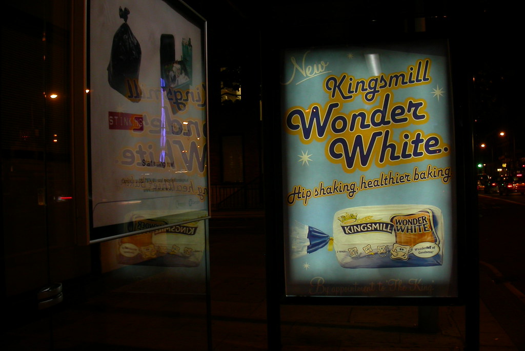
Other places: Stygge Oslo, “ugly Oslo,” a visual complaint about my home city’s public realm. Defending rural space in Italy, where Italian farmers fence their fields with mattresses, doors, and rebar. London, where the bus-shelter Wonder White subversion above happened. And the advertising tag on Flickr at large, 658 photographs cumulatively tagged over twenty years, the reservoir.
The argument
The visual environment of the city keeps being finished and re-finished long after the designer signs off, by the people who use it. By the weather. By the printers, the kids with markers, the farmer with a mattress, the council worker who paints the slash across the pedestrian sign, and the time that does the rest. A pedestrian-crossing sign with a drawn-on mohawk is a collaboration between the AIGA and whoever picked up the marker.
This is also a quiet argument about design humility. I have spent a career designing visual languages for RFID stickers, for touch interactions, for the gestures and graphical objects that No to NoUI argues are essential parts of the digital environment. The Inhabiting Advertising photographs are the record of what actually happens to designed graphic surfaces once they leave the studio. The pictogram that actually exists in the city is the one with the mohawk.
The work has a politics, particularly visible across Tirana, Stygge Oslo, and the Italian farmers’ fences. Edi Rama painting Tirana, the Italian farmer fencing his field with a bedstead, the corporate developer ruining Akerselva: each is a small act of authorship in shared visual space, and they carry weight. Who gets to mark the city? Who gets to mark the village? Whose aesthetic prevails? I select rather than editorialise inside the photographs, and the selection is the argument. Tirana colour is hopeful. Stygge Oslo is a complaint. Defending rural space in Italy is admiring.
Effects of the network sits alongside this. It photographs the digital sibling of the same urban surface: wifi stickers, camera-warning signs, network logos, GPS-pinned screens. Together the two projects are a twenty-year survey of how a city is marked, first by the analogue commercial layer, then by the networked one that grew over it.