Usability
7 posts tagged.
-
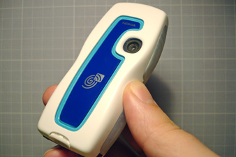
Nokia 3220 with NFC
A prototype Nokia 3220 NFC shell has been on loan from Matt Jones at Nokia for a few weeks. Touch it to a tag, the phone vibrates sharply, a light flashes, and something happens, a phone call, a web page, an SMS. It’s the second Nokia phone with an RFID reader-writer, and it is solid enough to build with.
-
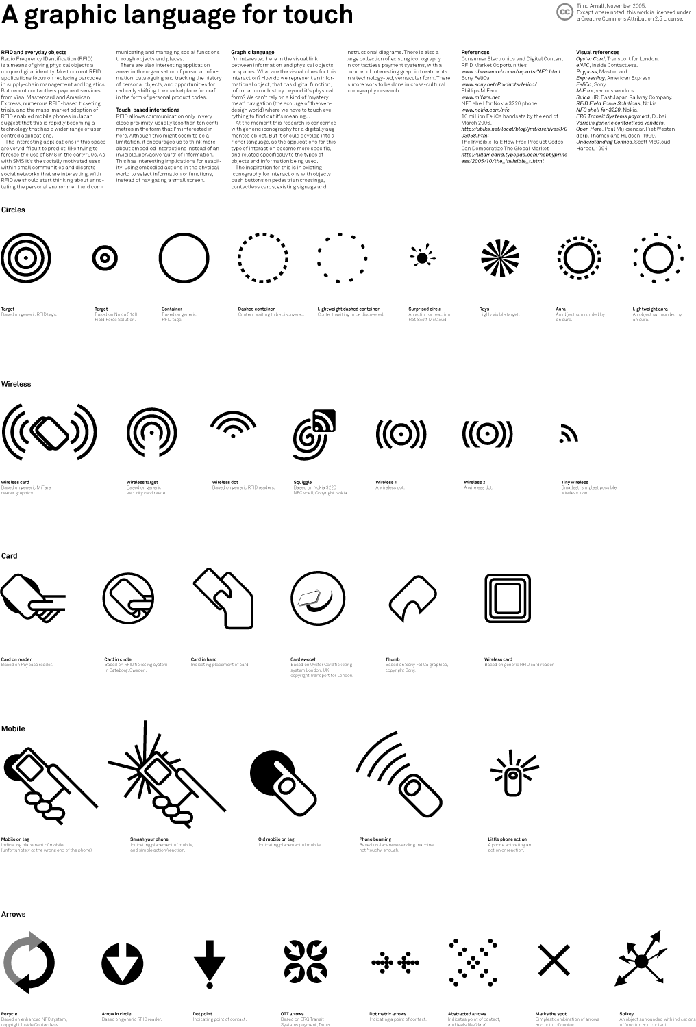
Graphic language for touch
How do we mark up the physical world so people know what’s touchable, and what happens when they touch it? A set of icons I sketched to find out, presented at Design Engaged in Berlin in November 2005.
-
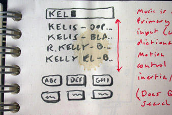
Embodied interaction in music
A set of sketches from Easter 2005 on navigating music on portable devices, written after switching from a 40GB iPod to the iPod Shuffle. The clickwheel doesn’t cut it on huge alphabetical lists. The sketches try predictive text input, squeeze-and-shake movement, audio scrubbing and gestures like covering an ear to switch tracks.
-
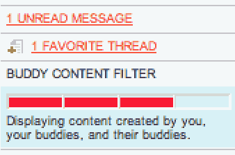
Social filtering for online forums
Yayhooray relaunched in June 2004 with a new version that uses social filtering to raise signal-to-noise. As far as I know, this is the first forum to use the buddy list as content filter. A short history of online-forum filtering approaches, and notes on what the new Yayhooray does.
-
Design for television
Eighteen points as a minimum type size, if you’re coming from a web background, equates to about 18 pixels. On some interactive television projects I’ve pushed it down to 16, but cautiously, because the production path to air usually punishes small type: DV tape, old composite links, online-edits with high compression. Leave type as large as the design will bear. Notes written in response to David Earls at Typographer.org, who had covered the basics of designing for television and prompted me to add a few things specific to interactive television, which I’d been working on at the time. In some cases (white text on a red background, for instance) a very subtle black drop-shadow will stop colour bleed and crawling effects. Even if you dislike drop-shadows, a subtle one will look flat and lovely on a broadcast monitor. Safe areas need to be taken with a pinch of salt. The default safe areas in most editing and compositing software date from before the widespread use of widescreen sets. Try extending the safe area for non-essential text in interactive projects, and consult broadcaster guidelines for their widescreen policies: many channels now broadcast in 14:9 to terrestrial boxes, with options for satellite and cable viewers.
-
Usability books
This is one of a series of reading lists I put together between 2002 and 2004 when I was starting out in interaction and experience design, building out a personal canon from books I was buying, borrowing from libraries, or lending to students. The lists are grouped by topic. This one is on usability, the discipline that gave interaction design its empirical grounding. Don Norman’s The Design of Everyday Things is the foundational book, and still the one to read first. Steve Krug’s Don’t Make Me Think is the approachable practitioner’s companion. Beyer & Holtzblatt’s Contextual Design is the canonical research-methods book, the one that taught a generation of designers how to watch users in their actual contexts. Nielsen is the dominant figure of the era, for better and worse; both his books are worth knowing even where you disagree. The Amazon links below are what I had at the time, most will be dead now, but the ISBNs will find you a copy. Donald Norman. amazon.co.uk / amazon.com Donald Norman. amazon.co.uk / amazon.com Douglas K. Van Duyne, James Landay, Jason I. Hong. amazon.co.uk / amazon.com John Cato. amazon.co.uk / amazon.com Hugh Beyer, Karen Holtzblatt. amazon.co.uk / amazon.com
-
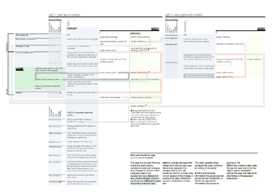
Mobile interaction design case study
A 2001 case study of consultancy work for Pollen Mobile, written up as it happened. Jack Schulze, Adi Nachman and I designed the interaction architecture for Mamjam, a location-based social entertainment service built on SMS, letting people in the same venue chat with each other by text.