Information Design
10 posts tagged.
-
Augmented (hyper)Reality
Augmented (hyper)Reality by Keiichi Matsuda A competent visualisation of an undesirable future.
-
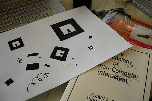
Augmented reality experiments
An afternoon with Even Westvang and ARtoolkit, the open-source library for augmented reality markers. No printer handy, so we drafted the markers by hand, stencilling them off the screen with a pencil and inking them in, and confused ARtoolkit by drawing them in perspective.
-
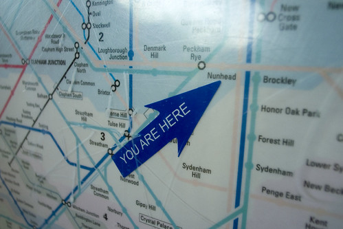
You are here
A 2006 note on collecting images of ‘you are here’ marks, or ideo locators, at Flickr. The relationship to local physical space is what makes them work: mapping with a point of view, maps as a direct interface to the world. The best example to date is from Seoul, where 3D cross sections of a metro station are directly related to the point at which you are looking at the map.
-
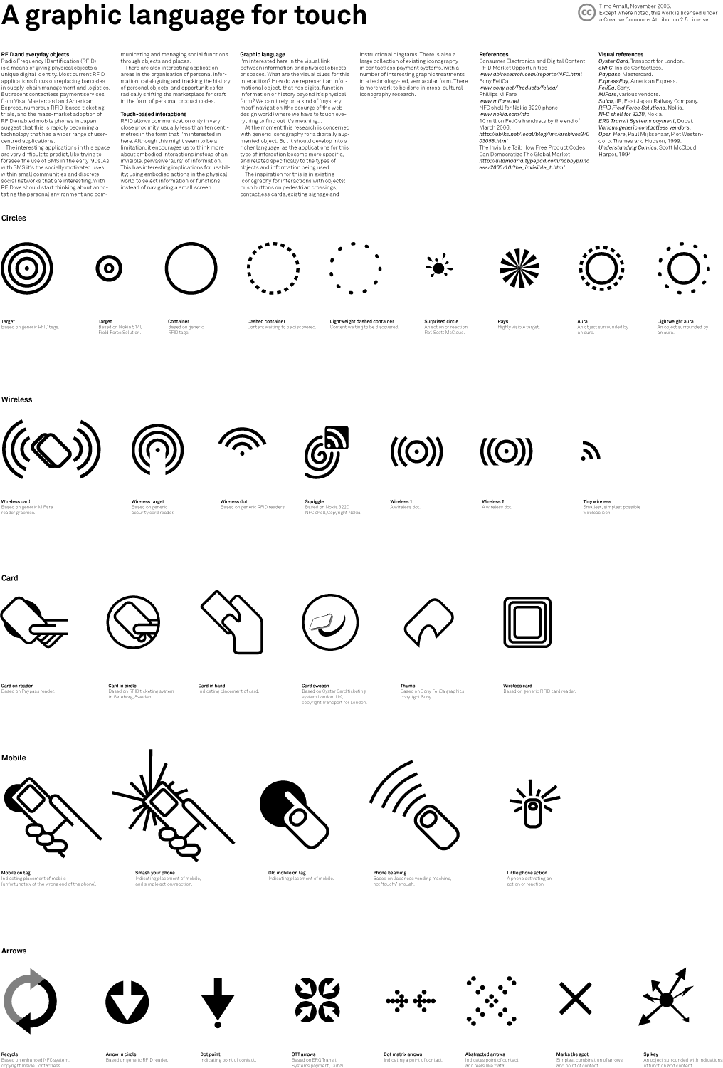
Graphic language for touch
How do we mark up the physical world so people know what’s touchable, and what happens when they touch it? A set of icons I sketched to find out, presented at Design Engaged in Berlin in November 2005.
-
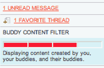
Social filtering for online forums
Yayhooray relaunched in June 2004 with a new version that uses social filtering to raise signal-to-noise. As far as I know, this is the first forum to use the buddy list as content filter. A short history of online-forum filtering approaches, and notes on what the new Yayhooray does.
-
Design for television
Eighteen points as a minimum type size, if you’re coming from a web background, equates to about 18 pixels. On some interactive television projects I’ve pushed it down to 16, but cautiously, because the production path to air usually punishes small type: DV tape, old composite links, online-edits with high compression. Leave type as large as the design will bear. Notes written in response to David Earls at Typographer.org, who had covered the basics of designing for television and prompted me to add a few things specific to interactive television, which I’d been working on at the time. In some cases (white text on a red background, for instance) a very subtle black drop-shadow will stop colour bleed and crawling effects. Even if you dislike drop-shadows, a subtle one will look flat and lovely on a broadcast monitor. Safe areas need to be taken with a pinch of salt. The default safe areas in most editing and compositing software date from before the widespread use of widescreen sets. Try extending the safe area for non-essential text in interactive projects, and consult broadcaster guidelines for their widescreen policies: many channels now broadcast in 14:9 to terrestrial boxes, with options for satellite and cable viewers.
-
Information design books
This is one of a series of reading lists I put together between 2002 and 2004 when I was starting out in interaction and experience design, building out a personal canon from books I was buying, borrowing from libraries, or lending to students. The lists are grouped by topic. This one is on information design: the discipline of making quantitative and complex information legible. Tufte’s three books (The Visual Display of Quantitative Information, Envisioning Information, Visual Explanations) are the canonical shelf. But Paul Mijksenaar’s Visual Function is the better first book: smaller, polemical, full of examples, and it prepares you to read Tufte critically rather than as scripture. Colin Ware’s Information Visualization is the scientific companion. Huff’s How to Lie With Statistics is the essential ethical counterpart, a reminder that information design can mislead as easily as it can clarify. The Amazon links below are what I had at the time, most will be dead now, but the ISBNs will find you a copy. Paul Mijksenaar. A small, beautiful and polemical book full of fine examples of good information design, read this before tackling Tufte. amazon.co.uk / amazon.com Edward Tufte. amazon.co.uk / amazon.com
-
Visual design books
This is one of a series of reading lists I put together between 2002 and 2004 when I was starting out in interaction and experience design, building out a personal canon from books I was buying, borrowing from libraries, or lending to students. The lists are grouped by topic. This one is visual design: grid systems, typography of form, colour theory, graphic design history, and the design-annual/showcase books that were the web’s main way of keeping track of itself before Flickr and RSS. Some of these are still essential (Muller-Brockmann, Itten, Albers, Rand, Pevsner). Some are of their moment (Reload: Browser 2.0 is a time capsule of early web design). The Amazon links below are what I had at the time, most will be dead now, but the ISBNs will find you a copy. Josef Muller-Brockmann. Magma Books / Niggli / UK booksearch Donis A. Dondis. amazon.co.uk / amazon.com Steven Heller, Elinor Pettit. amazon.co.uk / amazon.com Philip Meggs. amazon.co.uk / amazon.com Nikolaus Pevsner. amazon.co.uk / amazon.com Steven Heller. amazon.co.uk / amazon.com Steven Heller. amazon.co.uk / amazon.com Paul Rand. amazon.co.uk / amazon.com Paul Rand. amazon.co.uk / amazon.com Jost Hochuli, Robin Kinross. amazon.co.uk / amazon.com
-
Typography books
This is one of a series of reading lists I put together between 2002 and 2004 when I was starting out in interaction and experience design, building out a personal canon from books I was buying, borrowing from libraries, or lending to students. The lists are grouped by topic. This one is on typography, the deepest and oldest of the design disciplines, and still the one most interaction designers would benefit from reading into properly. Bringhurst’s The Elements of Typographic Style is the canonical reference. Robin Kinross’s Unjustified Text and his book on Karel Martens are the most useful English-language writing on typography as a critical practice. Spiekermann’s Stop Stealing Sheep is where to start if you’ve never thought about typefaces. Fred Smeijers’s Counterpunch is the book on punchcutting, the craft under the craft. The Amazon links below are what I had at the time, most will be dead now, but the ISBNs will find you a copy. Phil Baines. amazon.co.uk / amazon.com Phil Baines, Catherine Dixon. amazon.co.uk / amazon.com Harry Carter. amazon.co.uk / amazon.com Robin Kinross. amazon.co.uk / amazon.com Robin Kinross, Karel Martens, Jaap van Triest. amazon.co.uk / amazon.com Fred Smeijers. amazon.co.uk / amazon.com
-
Information architecture books
This is one of a series of reading lists I put together between 2002 and 2004 when I was starting out in interaction and experience design, building out a personal canon from books I was buying, borrowing from libraries, or lending to students. The lists are grouped by topic. This one is on information architecture: structuring and navigating information systems, the taxonomies and classifications behind them, and the wider theories of how information gets organised and shared. Rosenfeld & Morville’s book is the canonical introduction and still the best place to start. Bowker & Star’s Sorting Things Out is the essential theoretical counterpoint, a sociology of classification that any working IA practitioner should know. Brown & Duguid and Svenonius broaden it further into the social and philosophical foundations of information. The Amazon links below are what I had at the time, most will be dead now, but the ISBNs will find you a copy. Louis Rosenfeld, Peter Morville. Now in its second edition, undoubtedly the best introduction to IA. amazon.co.uk / amazon.com Richard Saul Wurman. amazon.co.uk / amazon.com Eric L. Reiss. amazon.co.uk / amazon.com Christina Wodtke. amazon.co.uk / amazon.com