Broadcast Design
2 posts tagged.
-
Design for television
Eighteen points as a minimum type size, if you’re coming from a web background, equates to about 18 pixels. On some interactive television projects I’ve pushed it down to 16, but cautiously, because the production path to air usually punishes small type: DV tape, old composite links, online-edits with high compression. Leave type as large as the design will bear. Notes written in response to David Earls at Typographer.org, who had covered the basics of designing for television and prompted me to add a few things specific to interactive television, which I’d been working on at the time. In some cases (white text on a red background, for instance) a very subtle black drop-shadow will stop colour bleed and crawling effects. Even if you dislike drop-shadows, a subtle one will look flat and lovely on a broadcast monitor. Safe areas need to be taken with a pinch of salt. The default safe areas in most editing and compositing software date from before the widespread use of widescreen sets. Try extending the safe area for non-essential text in interactive projects, and consult broadcaster guidelines for their widescreen policies: many channels now broadcast in 14:9 to terrestrial boxes, with options for satellite and cable viewers.
-
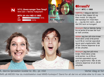
Mess TV: SMS and MMS community television
A nightly community TV show on TV Norge, running from 2am to noon the next day, carried largely by SMS and MMS messages submitted from mobile phones. I rebranded the show against the TV Norge visual identity, refined the SMS and MMS interaction scenarios, and advised on linear broadcast and interactive content.