Graphic language for touch
Tap your Oyster/Suica card on a reader and an icon or a yellow circle tells you where to hold it. But what about the new generation of mobile phones that can read and write to RFID tags embedded in objects, how do we mark up the physical world so people know what’s touchable, and what happens when they touch it?
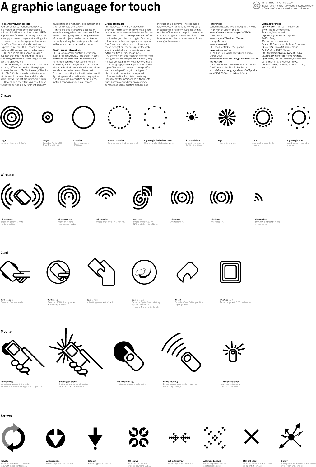
The problem is simple to state and hard to solve: how do you represent an object that carries digital function, information or history beyond its physical form? Without a visual language we fall back on mystery meat navigation (the scourge of the web), where you have to touch everything to find out what it does. RFID is already out there in Oyster cards and Suica cards and Nokia’s 3220 handset, but the graphic language for it hasn’t been worked out yet.
Here’s a set of icons I’ve been sketching to find out. This was a presentation and poster at Design Engaged in Berlin on 11 November 2005. Download the full set as a PDF (721KB) or see the Gif preview.
This doesn’t attempt to be a definitive system for marking physical things, it is an exploratory process to see how digital/physical interactions might work, while the technology is still largely out of the hands of everyday users.
Reference to existing work

The visual language I’m drawing on is already out there. Push buttons on pedestrian crossings, contactless cards at ticket barriers, signage, instructional diagrams. Public space is marked with iconography that works exactly because you don’t have to think about it. Photograph these markings and what surfaces is how much their legibility depends on where they sit. A sticker’s effectiveness is inseparable from its placement, and current research in ubicomp and locative media is not addressing these visibility issues.
Contactless payment systems have a rich, technology-led, vernacular iconography of their own: Oyster, FeliCa, MiFare, PayPass, Suica. In Japan there’s a further step, with touch-based interactions represented by characters, colours and illustrative icons that are abstracted from the action itself.
I’ve also had good conversations with Ulla-Maaria Mutanen and Jyri Engeström about thinglinks and the weaving of RFID into craft objects.
Development

Sketching surfaced five initial directions: circles, wireless symbols, card-based, mobile-based and arrows (see the poster for more detail). The icons range from generic (abstracted circles or arrows indicating function) to specific (mobile phones or cards touching tags).
Arrows work for specific actions when combined with other illustrative material. Icons showing phones or cards help in situations where you need basic usability for a wide range of users. Wireless-style symbols are widely used on card readers, but they don’t indicate the touch-based interactions inherent in the technology, and they get confused with WiFi and Bluetooth. Circular icons work at the most generic level, and are probably most suitable for generic labelling.

For further investigation I have selected a simple circle, surrounded by an ‘aura’ described by a dashed line. The circle marks the active point. The aura describes that the physical object carries something beyond its physical form, in a near-field way.

In most current NFC implementations, such as the 3220 from Nokia and many iMode phones, the RFID reader sits at the bottom of the phone. This means the area of activation is obscured by the phone and hand during the gesture. The circular iconography allows a space to be marked active by the size of the circle, and we might see it used to mark areas rather than points. Usability may improve when these icons are around the same size as the phone, rather than a specific point to touch.
Work in progress
This is early days for the technology, and this is work-in-progress. There is more to be done in looking at specific applications, finding suitable uses and extending the language to cover other functions and content.
Until now I have been concerned with generic iconography for a digitally augmented object. This should develop into a richer language as the applications for this type of interaction become more specific and related to the types of objects and information being used. For example, it would be interesting to find a graphic treatment that could be applied to a Pokemon sticker offering power-ups as well as a bus stop offering timetable downloads.
I’m also interested in the physical placement of these icons. How large or visible should they be? Are there places that should not be marked active? And how will this fit with the natural centres of gravity of the mobile phone in public and private space?
I’ll expand on these things in a few upcoming projects that explore touch-based interactions in personal spaces.
Feel free to use and modify the icons, I would be interested to see how they can be applied and extended.
Visual references
Oyster Card, Transport for London. eNFC, Inside Contactless. Paypass, Mastercard. ExpressPay, American Express. FeliCa, Sony. MiFare, various vendors. Suica, JR, East Japan Railway Company. RFID Field Force Solutions, Nokia. NFC shell for 3220, Nokia. ERG Transit Systems payment, Dubai. Various generic contactless vendors. Contactless payment symbol, Mastercard.
Open Here, Paul Mijksenaar, Piet Westendorp, Thames and Hudson, 1999. Understanding Comics, Scott McCloud, Harper, 1994.